INTRODUCTION TO MMM CONCEPT
About the navigation menu in general terms
Navigation is widely considered the fundamental element of any website. This is the ultimate guide for users throughout the links of the webpage, which explains why it needs to be simple, clear, and conventional. Its icons are always evident, and most designers agree that it is part of the layout we should be very careful with. Following studies of the navigation menu, we found that “perception” plays a key role. And when we accept that priority, we should make visual understanding easier. Following this logic, horizontal blocks are better than vertical ones, for the simple reason that most of us are accustomed to reading from left to right and not from up to down since early childhood. As a result, horizontal blocks make our natural reaction quicker. However, designers would rightly argue to accept this obvious fact as a rule, because in many cases the structure and the content of the page might justify arranging the blocks in vertical order.
Why is the navigation menu untouchable?
It is considered a web designer’s rule of thumb that in the navigation menus we should refrain from experimenting with unconventional solutions, as this part of the layout is the ultimate resort for the orientation of the visitor. The blocks are usually the same height and width, and the general scheme is HOME-ABOUT US-PRODUCTS-FAQ-CONTACT.
Stakes are high in online marketing. It takes merely a second for the average user to decide to stay or click away from us, and any risk to take inside the navigation bar has to be studied carefully.
Does this mean that the navigation menu is untouchable?
Not really, there are too many exceptions to regard this as a general rule. For example, a huge number of websites are designed in synergy with the extended communication strategy of a company or its products. In such cases, giving extra power to the general message is the overall priority.
Saxon Media created a solution: the Multiple Message Menu concept.
Multiple Message Menus (MMM)
MMM is a simple and creative concept to support the perception of general communication messages incorporated in the navigation bar of websites. A very typical case is when the user is guided to a web page driven by the fundamental message (for example, an advertising slogan) to the online service of the company. In our concept, we would only use horizontal menus and incorporate the message inside the block.
The navigation block is a basic element of the webpage, present in all sections of the site, which makes it an excellent vehicle to boost our message. How does this work? When we start designing, first we need to draw up a conventional menu bar for ourselves, then replace the words inside the icons so that the text, when the user looks at the block, transmits our message:
Conventional navigation bar:
HOME-ABOUT US-PRODUCT-FAQ-CONTACT
From this we can create an MMM navigation bar like this one:
MMM-CONCEPT-TARGETS-YOUR AUDIENCE
MMM is a concept that should be used carefully, though it is an exceptional opportunity to make our page both more effective and interesting. When MMM is justified, what we will certainly achieve is create immediate attention to the content of our site and to give extra power to our general message.
This might be more than nothing when we have only a second to win the race for the visitors.
Istvan Papp
2011

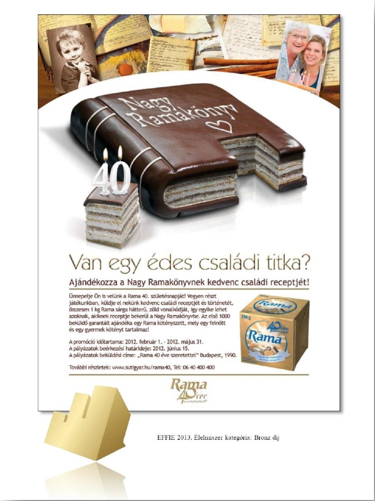
BAKING STARTS WITH LOVE—AND A GOOD RECIPE!
The Rama 2012 Baking ad campaign received a bronze medal in the Packaged Food category at the 2013 Effie Awards Gala.

MISS BALATON BEAUTY CONTEST: FULL COORDINATION
The scope of the Miss Balaton Beauty Contest is to present the most beautiful ladies of the summer and to elect the Queen of the “Hungarian Sea”, who would later represent

BOSCH PROFESSIONAL EVENTS: ONLINE CAMPAIGN
In the first half of 2017, we have been commissioned by Bosch to launch and conduct online campaigns for the Bosch Hardware Night and Bosch
